Other University Symbols

Various official symbols exist at Penn State in addition to the University mark. These symbols have specific uses and functions and are not interchangeable with the University mark.

Other University Symbols //

University Seal

The seal has been in existence in one form or another since the founding of the University. The current version was introduced in 1953 and features the crest of the Commonwealth of Pennsylvania surrounded by the name of the University. It bears a striking resemblance to the seals of many other state agencies, including the State System of Higher Education, which is the one reason it does not serve as the University’s logo. Since implementation of the University mark in 1987, the seal has served primarily as an official stamp of validation–like a notary’s stamp–on official documents such a contracts and diplomas.  

Some versions of the University seal feature a fluted edge. However, the current version with a clean, smooth edge is preferred. The same artwork is used for both positive and reverse reproductions.  

NOTE: The University seal is a registered symbol of the Pennsylvania State University and its uses are strictly controlled by the University. Information about the University seal also is available on the Licensing website. Questions regarding use of the seal may be directed to the Office of Strategic Communications at pennstatebrand@psu.edu.

Other University Symbols //

The Nittany Lion

Nittany Lion Mascot Caricatures

Nittany Lion Mascot (“Mascot”) caricatures are available for use by Penn State faculty, staff, and students to represent Penn State pride and spirit. The Nittany Lion Mascot artwork conveys the same traits that our live mascot is famous for such as friendliness, energy, and stellar sportsmanship. Likewise, the Nittany Lion Mascot caricatures must represent Penn State in a positive manner in all use instances. The Mascot caricatures may only be used as decorative artwork in connection with University communications. Penn State faculty and staff may use the artwork in accordance with the University’s Code of Responsible Conduct. Recognized Student Organizations may also use the artwork for their organization’s communications in accordance with the University’s student Code of Conduct

Any use of the Nittany Lion Caricature artwork must adhere to the following standards: 

Personal or Non-University use is not permitted. Do not share artwork with non-University parties unless authorized by the Office of Strategic Communications in writing. 

A Mascot caricature may not be used as a logo for a specific area, initiative or recognized student organization.  

Mascot caricatures should not be graphically altered. Text or graphics may be placed near the Lion but not touch it.  Do not change the Mascot’s color or general appearance as shown. The following exceptions are permitted: 

  • Copy may be added to the sign used in the “Mascot Placard” pose. Sign content may include event information, announcements or positive cheer messages such as “We Are Penn State”. Student content must not violate the University’s student Code of Conduct.
  • Specific per-caricature cropping guidelines are available in the downloadable pdf.

The Nittany Lion Mascot caricatures are not available for use on merchandise items at this time.   

Questions about the use of the Nittany Lion Caricatures may be directed to the Office of Strategic Communications at pennstatebrand@psu.edu. Nittany Lion Caricature files are available for download.

NOTE: In accordance with Penn State Policy AD07, Use of University Name, Trademarks, Symbols, Logos and/or Graphic Devices, the Nittany Lion is considered University Indicia; therefore, the use of this artwork is a direct reflection of the University. Policy AD07 seeks to protect the University’s name and reputation by regulating the use of the University indicia to prevent uses that are not supportive of the University’s mission or values and protect the University from the liability of misrepresentation.

Nittany Lion with Backpack (color and black-only); Nittany Lion Number One (color and black-only).

Nittany Lion with Basketball (color and black-only); Nittany Lion with Cake (color and black-only).

Nittany Lion with Football (color and black-only); Nittany Lion Graduate (color and black-only).

Nittany Lion with Lab Coat (color and black-only); Nittany Lion Looking at Sign (color and black-only). 

Nittany Lion with Placard (color and black-only); Nittany Lion Reading (color and black-only). 

Nittany Lion Shrine Illustrations 

Line drawings of both the full-bodied view of the statue and three-quarter view of the statue’s head have been standardized as "classic" Nittany Lion artwork. Nittany Lion Shrine illustrations are available for download.

NOTE: Classic Nittany Lion artwork is trademarked by The Pennsylvania State University and its uses are strictly controlled by the University. Information about classic Nittany Lion artwork also is available on the Licensing website. Questions regarding the use of this artwork may be directed to the Office of Strategic Communications at pennstatebrand@psu.edu.

Faceted Lion Shrine

A more stylized, abstract interpretation of the Nittany Lion Shrine is now available for use. The brilliance of this modern graphic is inspired by multi-faceted gemstones, evoking the diverseness and adaptability of our University.

There are three design iterations in four different styles available for download; please see the references below. All versions are provided in black, white, Nittany Navy, and Beaver Blue as Adobe Illustrator “.ai” vector files. These Faceted Lion Shrine designs can be used with other brand design elements; always be mindful of clarity and maintaining the integrity of all elements used in a given layout.

Do not change the color or general appearance as shown.

The Faceted Lion Shrine is not available for use on merchandise items at this time.

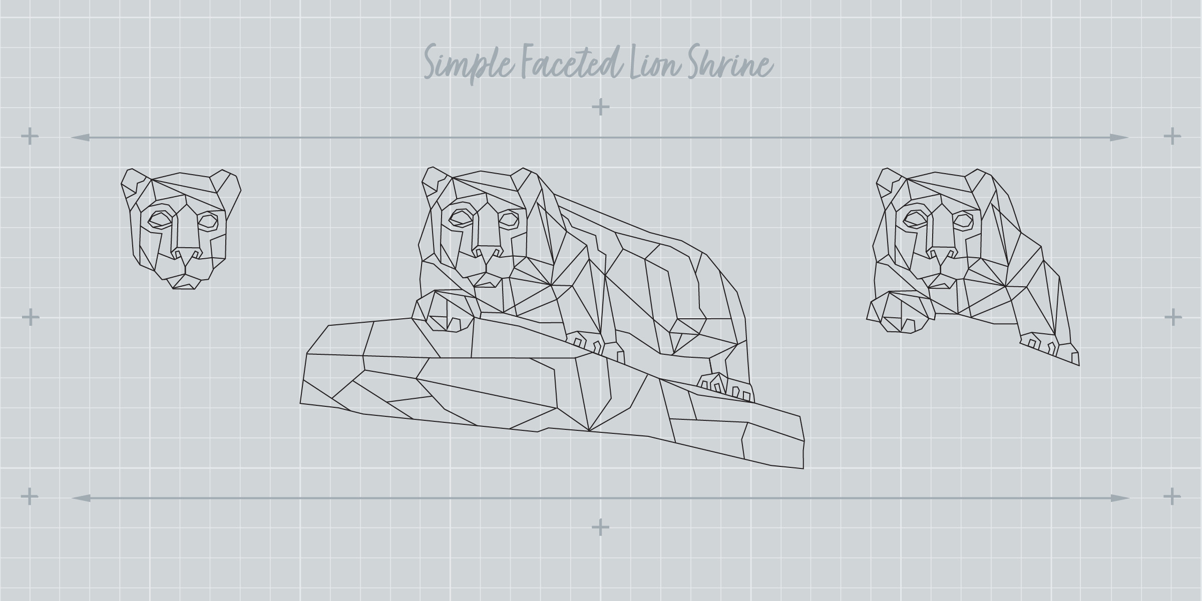
Simple Faceted Lion in black: Full Body, Torso, Head (CMYK, RGB). Also available in white Nittany Navy, and Beaver Blue.

Simple Faceted Lion with ‘S’ Curve in black: Full Body, Torso, Head (CMYK, RGB). Also available in white Nittany Navy, and Beaver Blue.

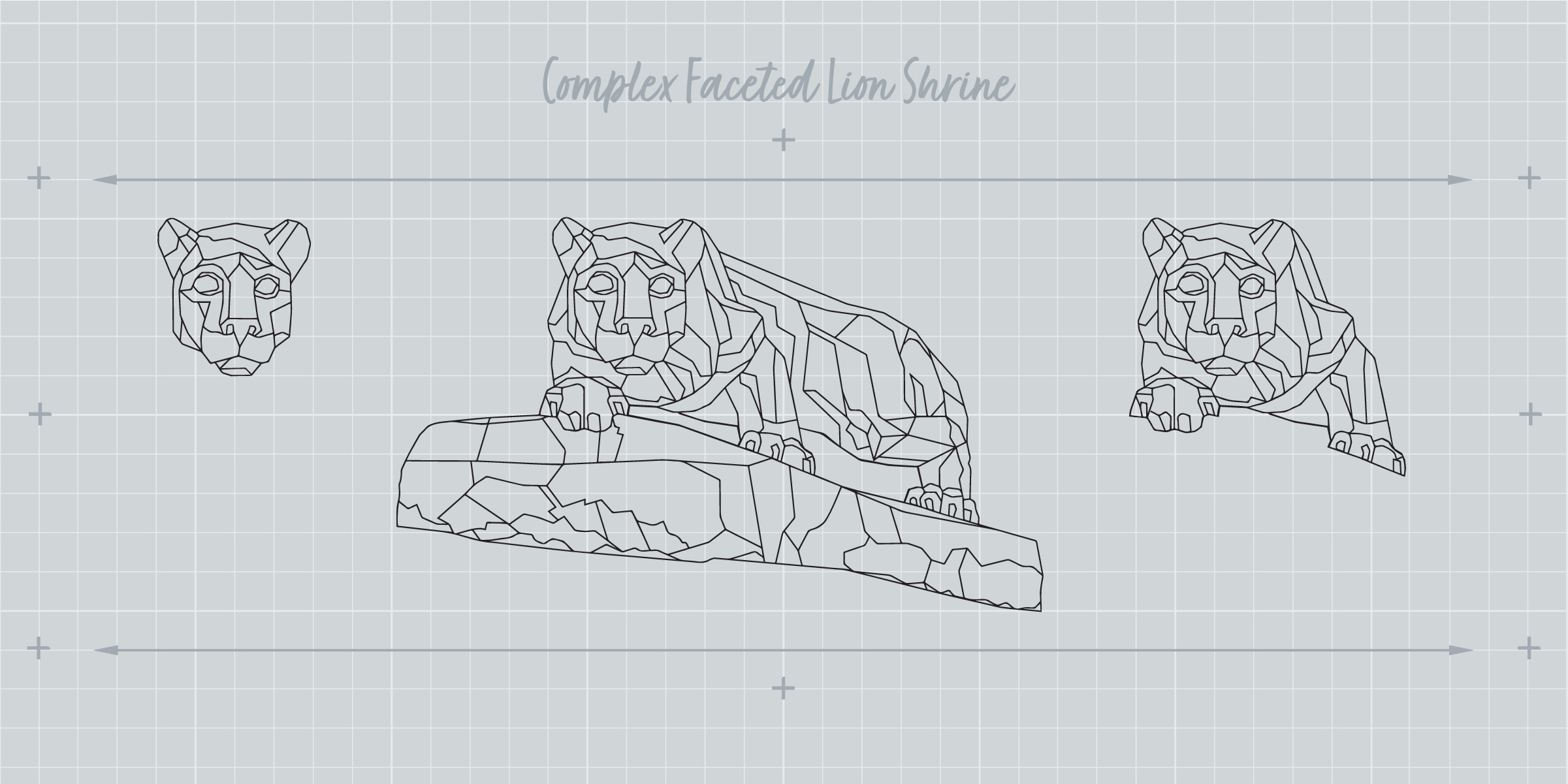
Complex Faceted Lion in black: Full Body, Torso, Head (CMYK, RGB). Also available in white Nittany Navy, and Beaver Blue.

Complex Faceted Lion with ‘S’ Curve in black: Full Body, Torso, Head (CMYK, RGB). Also available in white Nittany Navy, and Beaver Blue.

Nittany Lion Paw Print 

The Nittany Lion paw print graphic is available for use by Penn State faculty, staff, and students to represent pride and spirit. The paw print files are available for download. The paw print is trademarked by the University and must not be graphically altered. Other requirements are: 

  • Text or graphics may be placed near the paw print but should not touch it.
  • Use a paw print as accent artwork for Penn State materials but not as a logo for a specific area or initiative.
  • Text or graphics should not be placed within the paw print or in the space between the toes and palm.
  • Blue is recommended for brand consistency. Black, as well as other colors, requires approval.
  • Merchandise featuring the paw print must be produced by licensed vendors (visit the Licensing website for more information), and requires a registration symbol in the location shown below.

Paw Print shown in blue and in black

Paw Print with white outline for use on dark background; Registered trademark symbol location

Do not use the paw print with the name of a campus, college, academic unit, or use as a replacement for the academic mark’s shield; Do not reverse the paw print in white

NOTE: Exceptions to the above information must receive advance approval from the Office of Strategic Communications. Contact Strategic Communications at pennstatebrand@psu.edu for approval or more information.

Other University Symbols //

Penn State Athletics Mark

Penn State Intercollegiate Athletics uses a specific graphic for branding athletic activities and communications. This symbol is often referred to as the Penn State Primary Athletic mark.   

  • This mark may be used to represent Penn State Intercollegiate athletic activities. It should not be used to represent the University’s academic areas or non-athletic communications and may not be used as a replacement for the Penn State University (or academic) mark.
  • Use of the Athletic logo by anyone other than Penn State Athletics staff requires approval by the Office of Licensing Programs. Email licensing@psu.edu.
  • The Primary Athletic mark’s official color is dark blue (PMS 282) when used on a white background. It appears as dark blue (PMS 282) and white when used on any other background color. Use of other colors will require approval by the Office of Licensing Programs.
  • The lion head always faces right. Do not reverse the orientation.
  • Do not alter the mark nor visually attach unapproved text or graphics near or around its perimeter.
  • Merchandise must be produced by official licensed vendors (visit the Licensing website for more information), and requires trademark designation. Note the location of the registration symbol.

Primary Athletic mark

Primary Athletic reverse mark on a dark background.

Do not place the Primary Athletic mark on distracting backgrounds.

Above is an incorrect reverse of the positive art. It’s easily identified by the white cheek. Instead, use the correct reverse mark as shown above.

NOTE: Exceptions to the above information must receive advance approval from the Office of Strategic Communications. Email pennstatebrand@psu.edu for artwork or more information.

Other University Symbols //

University Marks and Symbols on Merchandise

Penn State names, marks, and symbols are featured on thousands of pieces of merchandise items found in the marketplace. Any merchandise featuring a registered or trademarked Penn State name, mark, or symbol, regardless of who produces it or for what purpose, must follow appropriate visual standards and licensing agreements. Additionally, any University names, marks, or symbols appearing on merchandise should include either the registration symbol [®] or trademark symbol [™] depending on what is appropriate. 

Any University unit that would like to produce an item of merchandise should start by visiting the Licensing Programs website or calling 814-865-0356 to locate a licensed vendor or ask questions. University faculty and staff may use Penn State names, marks, and symbols, according to established visual and editorial guidelines, on any materials to be used for recruitment, development, or general promotion of the institution. However, when merchandise or specialty products such as shirts, ball caps, mugs, pens, etc. are produced, those items are subject to a promotional agreement from the Office of Licensing Programs. This is the case whether the item is to be given away for free or sold for profit. In all cases, merchandise and specialty items must be produced by licensed Penn State vendors.  

Lapel Pins 

Lapel pins are a popular merchandise item used to show Penn State spirit on clothing. The shield represents the Penn State community and is the preferred lapel pin artwork. However, when Penn State unit identification is necessary, an alternate lapel pin template is available. This template maintains the graphic integrity of our shield, while allowing space to add a unit title. 

  • Unit titles (college, campus, or administrative areas) may be placed in the lower half of the outer rim.
  • Do not alter the design or reduce the type size. The space for type is limited.
  • The recommended lapel pin size is a 1-inch diameter.
  • Lapel pins must be produced by a licensed vendor. Visit the Licensing website for a list of licensed vendors.
  • This lapel pin template is designed for internal Penn State use. It is not for commercial use.
  • Penn State-related initiatives may be used instead of unit names.

Lapel pin, shield only

Lapel pin template for unit identity. Do not use the lapel pin design template for unit identification in University communications or other items. It is not a replacement for an academic mark. Do not use in any manner that attempts to replicate the University seal.

NOTE: Artwork is available from the Office of Strategic Communications. Exceptions to the above information must receive advance approval from the Office of Strategic Communications. Email pennstatebrand@psu.edu for artwork or more information.

Other University Symbols //

Anniversary Tags

An anniversary tag may used as a graphic accent on most University marketing communications to celebrate the milestone.  

  • An anniversary tag may be used for a college, campus, school, center, institute, museum or university business.
  • The tag should appear in a location secondary to the academic mark, such as the bottom of a flyer or the footer of a webpage.
  • Use the tag on print or web marketing communications. However, it may not be added to University stationery produced at the Multimedia and Print Center. The tag may not be used to create new stationery that would not conform to the University’s standardized stationery formats.
  • An anniversary tag should be a simple graphic with minimal copy. Tags typically contain the anniversary year or applicable dates and possibly minimal art or text.
  • Duration for use is limited. Remove the tag from circulation at the end of the anniversary year.
  • A tag must not replace or visually complete with the academic mark.
  • Do not use a shield shape or lion artwork. Do not attempt to replicate the University seal.
  • A tag is not a logo.
  • Avoid using the University’s name or the title of the area being recognized.

Example of a campus anniversary tag

Example of a school anniversary tag 

NOTE: Anniversary tag artwork requires advance approval by the Office of Strategic Communications. Send questions or artwork to pennstatebrand@psu.edu.

Other University Symbols //

University-Recognized Student Organization Mark

Penn State Recognized Student Organizations may use a special version of the University's mark on their materials and communications. The University-Recognized Student Organization Shield Mark is made available through Office of Student Affairs, and graphic files may be requested at Student Activities Offices at campus locations. University Park organizations should email studentorg@psu.edu to request the graphic files.  

The mark design is unique to Recognized Student Organizations and features the only University trademarked symbol that may be used to graphically identify a Recognized Student Organization. When using this mark, it may not be altered in any way. Organizations must adhere to the University’s color and correct mark use standards. 

In addition to communications, any merchandise that features a University-Recognized Student Organization Mark must be produced by a University licensed vendor. A vendor list is available on the Licensing website. 

legs of students sitting on a wall

Mark Usage Examples

In order to maintain a strong visual identity system, it’s important to understand both proper and improper mark usage. The following examples provide explanations on how to use our mark effectively as well as what to avoid.

Mark Usage Examples //

On Photos and Images

As described on the Color and the Mark page, we can use our mark on both light (positive mark with blue logotype) and dark photographs (reverse-use mark with white logotype). When using our mark on images, be mindful to avoid strong patterns, textures, or shapes that may affect legibility. The principles demonstrated here apply to our college, campus, and administrative/academic unit marks. 

NOTE: View the full standards on using our mark on light and dark backgrounds on the Color and the Mark page.

Two-color mark, on light background
Two-color reverse mark on dark background
Two-color mark on light background

In this example, the head of the student is within the minimum clear space but still works. Any closer would feel cramped.

Two-color reverse mark on dark background

The image of the beakers is subtle and dark enough for the reverse mark to work.

Mark Usage Examples //

Websites

psu.edu

Bellisario

Eberly

Mark Usage Examples //

Merchandise

Trademark designations are required for items that bear the University’s mark that are for commercial use. Please contact: licensing@psu.edu for questions related to Penn State merchandise or visit their website at licensing.psu.edu 

This mug demonstrates how the vertical mark 2 can be used. The focus on the large graphic image of the shield works well while keeping our name visible.

The use of our shield allows for a sophisticated pin. While the use of the shield alone is rarely permitted, this use is fully appropriate.

Mark Usage Examples //

Social Media Avatars

The Penn State social media avatar guidelines are intended for all official Penn State social media accounts. These guidelines aim to achieve brand recognition, design consistency, and credibility with all Penn State social media avatars.  Achieving all three goals protects and elevates the University’s image and reputation, while also providing needed design variety.

The Nittany Lion shield is used consistently to ground all social media avatar designs in the Penn State brand architecture. There are two avatar categories provided:  

Category 1 avatars are reserved for Penn State social media accounts managed by the Office of Strategic Communications within the office of the President and for all the main social media accounts for all the Penn State Commonwealth Campuses. The avatars are provided in text and non-text versions.  

Category 2 avatars are intended for all other colleges, schools, departments, units, institutes, centers, and administrative offices at Penn State. Although there are different limitations regarding name length across social media sites, the templates provided enable up to two lines of customizable text, as well as non-text options. If a name does not fit in the font point size and spacing provided in each text template, please use a non-text version. The specific text parameters are designed intentionally, please do not alter them.

The avatars provided are optimized for resolution and clarity. Resizing and cropping should be avoided, as this will alter the resolution and image quality of the avatar.  

NOTE: Because of the uniquely small size of the avatar canvas, we are allowing an exception to the general visual identity guidelines that restrict locking-up text with the shield.

CATEGORY 1 // EXAMPLES

ADDITIONAL DESIGN OPTIONS ARE AVAILABLE UPON REQUEST.

CATEGORY 2 // EXAMPLES

ADDITIONAL DESIGN OPTIONS ARE AVAILABLE UPON REQUEST.

Our brand partners can download the official Penn State social media avatars and guidelines from our Master Downloads.

Mark Usage Examples //

Mobile App

The Penn State Mobile App visual identity guidelines are intended for Penn State mobile apps relating to academic, research, and administrative functions including Outreach*. These guidelines aim for brand recognition, design consistency, and credibility. Achieving all three goals protects and elevates the University’s image and reputation, including each program, initiative, or unit creating an app. 

*These guidelines do not directly apply to apps that are developed as part of a partnership, collaboration, or co-branded initiative. For clarification or support, please contact pennstatebrand@psu.edu.

Mobile App Overview

The Penn State name and/or visual identity should be properly represented in one or more of the following ways (as indicated): App Name (preferred), App Icon (mandatory), App Subtitle, Description, Promotional Text, and/or Keywords (preferred), App Screenshots or Previews (preferred), App Splash Screen (preferred), App Home Screen (mandatory).

App Icon Option 1

App Icon Option 1: A complete Penn State vertical 1 or vertical 2 mark helps to convey a credible, university-produced app.

App Icon Option 2

App Icon Option 2: The Penn State icon template design uses the text “Penn State” in white on Nittany Navy and as Nittany Navy on white. Underneath this heading (that displays “Penn State”), designers can have full flexibility to incorporate custom text, colors, and other designs. 

App Icon Option 3

App Icon Option 3: The Nittany Lion shield alone. Because this option is not a mark that includes “Penn State,” consider using the Nittany Lion shield logo only if your app name includes “Penn State.”

App Icon Option 4

App Icon Option 4: Using Proxima Nova, add your campus, college, or other unit name just below the Nittany Lion shield logo. Please follow the spacing used in the Penn State vertical 1 mark. 

App Subtitle, Description, Keywords, etc

For brand recognition, using “Penn State” in one or more of the content fields is recommended. 

App Splash Screen

This introductory screen appears briefly while an app is loading. To maximize the full device canvas, consider using the University Mark or Tier 2 entity mark over an approved brand color or gradient. Several splash screen backgrounds are provided as options for your splash screen designs. 

App Home Screen

It is mandatory to use the Tier 2 entity mark identifying the associated Penn State campus, college, or administrative unit. 

Additional Mobile App Developer Resources:
Apple’s App Developer Page / https://developer.apple.com/app-store/product-page/
Android’s App Developer Guide / https://developer.android.com/guide

NOTE: Only RGB files of Penn State’s academic marks should be used for mobile apps in order to reproduce accurate color.

NOTE: Because of the uniquely small size of a mobile app’s icon canvas, we are allowing an exception to the general visual identity guidelines that restrict locking-up text with the shield.

Our brand partners can download the official Penn State Mobile App Icons, Gradient Backgrounds and guidelines from our Master Downloads.

Mark Usage Examples //

Mark Misuse

The incorrect mark use here is representative of the ways in which marks are often misused. The incorrect use of a mark tends to give license to, and spawn, other misuses. 

Never redraw or try to recreate our mark, including our shield or logotype. Any modification of our mark diminishes its impact and weakens our legal protection. Only authorized artwork may be used. 

Do not change the size relationship or position of the mark or logotype

Do not change the color of the mark or logotype

Do not reset the name in another font or color or add a word space

Do not use the logotype without the shield.

Do not distort or add special effects to the mark

Do not change the position or orientation of the mark

Do not use the reverse artwork on a light background

Do not place the logo on a distracting pattern or images

Do not use the positive artwork on a dark background

Do not remove the white shape behind the shield

Do not use any previous marks

Mark misuse: On images 

The incorrect mark use on this page is representative of the ways in which marks are often misused. The incorrect use of a mark tends to give license to, and spawn, other misuses. 

One challenge is to avoid strong patterns or textures that impinge on legibility. The other consideration is avoiding objects or strong shapes within the image. 

In the lower set of images we show how shapes with different degrees of transparency can be used to create a less disruptive field to place the mark. 

Do not let objects impinge on clear space

Do not let mark appear to affect the image

Do not place mark on contrasting values

Do not place mark on contrasting values

Do not place mark on contrasting texture

Mark misuse: Avatar 

The incorrect avatar use on this page is representative of the ways in which marks are often misused. The incorrect use of a mark tends to give license to, and spawn, other misuses. 

Never redraw or try to recreate our avatar. Any modification of our shield diminishes its impact and weakens our legal protection. Only authorized artwork may be used. 

Do not change the size of the avatar

Do not crop the avatar

Do not reposition the avatar

Do not distort or add special effects

Do not add any names to the avatar

Do not use the reverse shield

Do not use photographs as the avatar

Do not use any previous avatars

Do not use names as the avatar

Do not alter the colors

Mark misuse: Entities 

The incorrect mark use on this page is representative of the ways in which marks are often misused. The incorrect use of a mark tends to give license to, and spawn, other misuses. 

Never redraw or try to recreate our entity mark, including our shield, logotype, and entity name. Any modification of our mark diminishes its impact and weakens our legal protection. Only authorized artwork may be used. 

Do not change the size relationship or position of the entity name

Do not change the color of the entity name

Do not change capitalization, letter spacing, color, or typeface of entity name

Do not use the reverse-use artwork on a light background

Do not place the mark on a distracting pattern or image

Do not use the positive use artwork on a dark background

Do not remove the white shape behind the shield

Do not change the position or orientation of the shield

Do not use abbreviations in an entity mark

Do not distort or add special effects

Do not remove the logotype

Do not remove the shield

Do not use a tier 3 name to replace a tier 2 name in a entity mark

Do not use a tier 4 name to replace a tier 2 name in a entity mark

Do not use a tier 3 name with an entity mark

Do not create entity logos to replace the shield

Do not rearrange the hierarchy of our names or create other logos

Do not create or add entity logos to our mark

Do not co-brand or use more than one together or separately on a page

Do not use entity marks similar to the those below.

Tier 3: Schools, departments

Tier 3a: Schools, departments

Tier 4: Areas of expertise, programs

Tier 4a: Areas of expertise, programs

happy graduates at commencement

Brand Architecture

Brand architecture is a powerful tool that allows us to connect the many entities within our University in a clear, logical manner. We achieve this by creating a system for entities that use our mark, as shown here. These entity marks include our campuses, colleges, administrative/academic units, institutes, departments, and areas of expertise.

Brand Architecture //

Tier 1

This is our primary University mark. This tier 1 mark is the overarching entity to which all other entities are connected.

Brand Architecture //

Tier 2

Tier 2 marks include entities such as all campuses, all colleges, and approved administrative/academic units

NOTE: When the Penn State logotype has an entity name below it, the logotype moves toward the top of the shield. This is done to maintain a visual balance between the shield and logotype. The same University mark principles on color use, clear space, minimum size, etc., apply to our entity marks, as well.

NOTE: Never redraw or try to recreate any of our entity marks, including our shield or our logotype. Any modification of our mark diminishes its impact and weakens our legal protection. Only authorized artwork may be used.

Brand Architecture //

Tiers 3 and 4

Tier 3 and 4 marks include entities within our campuses, colleges, and approved administrative/academic units such as schools, departments, institutes, centers, programs and laboratories

VERTICAL ALIGNMENT EXAMPLE

HORIZONTAL ALIGNMENT EXAMPLE

NOTE: Individual unit logos generally are not permissible. A distinctive “look” for communications may be achieved through the consistent use of color, design, and photographic style. Units should not develop any special symbols or wordmarks as a graphic identifier. All marks must first be approved by contacting the Visual Identity Office within the Office of Strategic Communications at pennstatebrand@psu.edu.

students working in a lab with red walls

Color and the Mark

Color is an important component of Penn State’s visual heritage. Our University mark and shield retain the traditional dark blue, referred to as PSU Dark Blue, as our core color, while adding a lighter blue, PSU Light Blue, to define the shadow on the Lion’s face.

Color and the Mark //

Two-Color Marks

Our preferred color version is the two-color mark with PSU Dark Blue and PSU Light Blue. This two-color mark should be used on most applications. 

The color versions shown here are the primary ways our mark will be seen. Note that placing the mark on another color or photographic background is acceptable as long as it adheres to our visual identity standards. 

Two-Color Mark with PSU Dark Blue and PSU Light Blue
Color and the Mark //

One-Color Marks with Screen

One-color applications may use PSU Dark Blue with a screen as a cost-saving measure, or black with a screen, which is intended primarily for ads in newspapers or other inexpensive applications. 

One-Color Mark, PSU Dark Blue with Screen
One-Color Mark, Black with Screen
Color and the Mark //

One-Color Without Screen

We have created artwork where reproduction with only one color, without any screens, may be necessary. 

Examples where this use is possible include: 

  • creating a watermark for letterhead
  • printing on a coaster where printing with a screen would bleed
  • printing with a foil stamp
  • embossing or debossing
  • printing on an object, such as a baseball

These special-use marks can be used in PSU Dark Blue or black. These marks should not appear in other colors with the possible exception of silver or gold for processes such as foil stamping or metal engraving. The use of this one-color without screen mark also applies to all of our entity marks as well. 

NOTE: The use of our primary horizontal mark in two colors is always preferable. While this one-color mark appears to be the same as the primary mark with the light blue removed, it has important differences.

Mark, One-Color Without Screen
Shield, One-Color Without Screen
Vertical Mark 1, One-Color Without Screen
Vertical Mark 2, One-Color Without Screen
Color and the Mark //

Reverse-Use Marks

Our reverse-use marks are not simply the positive marks with a white logotype. The scale, position, and weights have been optically adjusted. Use the reverse-use marks on dark backgrounds. 

Two-Color Reverse Mark with PSU Dark Blue and PSU Light Blue

This is the preferred color version of the reverse-use mark.

One-Color Reverse Mark, Dark Blue and Screen
One-Color Reverse Mark, Black with Screen
Color and the Mark //

Positive White Mark

For most communications needs, the University mark, featuring Pantone 287 and 284, is recommended. However, there may be a need for a mark to appear in white only. This is often the case when purchasing merchandise and budget restrictions may allow for only one imprint color on dark background.   

A positive white mark is available for all approved marks. When this mark is used, the shield will be transparent, and the background color will fill the shield’s space around the Lion. Because of this effect, the positive white mark may only be used on a blue, black or clear/glass background. The shield should not appear to be “filled” with any other color. Do not attempt to create a white mark by simply assigning white to a one-color black mark. This does not produce the correct effect. See the example below. 

Positive white marks are not downloadable from this site; however, the University’s licensed vendors will have access to these marks since the positive white marks are used mainly for merchandise. If you need to use a positive white mark for something other than merchandise, contact the Office of Strategic Communications at pennstatebrand@psu.edu. 

Correct Use 

The positive white mark may be used on solid blue, black or clear (glass) backgrounds. 

Correct Use

Incorrect Use 

Do not attempt to create a white mark by assigning white to a one-color, black mark. Do not use a white mark on any background color other than solid blue, black or clear glass due to the transparent background.  This ensures that the shield’s interior will appear in acceptable brand colors. 

Do not place a positive white mark on patterns or distracting backgrounds. 

Incorrect Use
Incorrect Use
Color and the Mark //

On Background Colors

We can use our mark on both light and dark background colors as well as on subtle textures. This use is possible because of the white outline around the shield, which provides a separation from the background and prevents common conflicts between marks and backgrounds with similar values or hues. These background principles apply to the vertical marks, as well as all entity marks. The colors shown here are not part of a specific color palette and are for demonstration purposes only. 

NOTE: Never alter our positive-use or reverse marks. Although both marks look very similar aside from the color of the logotype, there are subtle design differences between each. The reverse mark is slightly smaller than the positive-use mark because the white outline makes the mark appear larger. The logotype is also drawn slightly thinner because white letters appear bolder than dark letters on white.

Light Backgrounds 

The positive-use mark with the blue logotype is used on light backgrounds.  

Positive Two-Color Mark on White
Positive Two-Color Mark on 10% Black
Positive Two-Color Mark on 20% Black
Positive Two-Color Mark on 30% Black

The middle background values, from 30% to 40%, are the most challenging regarding the legibility of our logotype.

Positive Two-Color Mark on Pugh Blue
Positive Two-Color Mark on Paper Texture

Dark Backgrounds 

The reverse-use mark with the white logotype is used on dark backgrounds that are darker than approximately 35% black. This also applies to color backgrounds or simple background photographs. 
 

Reverse Two-Color Mark on 40% Black

The middle background values, from 30% to 40%, are the most challenging regarding the legibility of our logotype.

Reverse Two-Color Mark on 60% Black
Reverse Two-Color Mark on 80% Black
Reverse Two-Color Mark on 100% Black
Reverse Two-Color Mark on Nittany Navy
Reverse Two-Color Mark on Land Grant
Color and the Mark //

Color Specifications

The information here provides specifications to manage our mark colors in Pantone®, CMYK, and RGB color systems. The color versions demonstrated here apply to the use of our mark as part of a college, campus, or administrative unit mark. Artwork, including positive and reverse use, have been prepared for all color versions demonstrated here. This includes Pantone® artwork for match-color printing, CMYK artwork for four-color process printing, and RGB artwork for web PowerPoint and Word applications. 

Colors look different in application, from match- to four-color process, from page to screen, and even coated to uncoated paper stocks. When trying to match our colors in other media, such as a thread for stitching or silk-screen, use the Pantone® coated color swatch to match. 

reflection of trees in windows on building

Mark Sizing and Placement

To effectively identify our communications, our marks need to have visual presence. Being mindful of minimum clear space, sizing, and alignment is vital to ensuring our University mark maintains its integrity across various applications.

Mark Sizing and Placement //

Clear Space

Minimum Clear Space

Use minimum clear space around a mark only when there are unavoidable space limitations. One way to ensure the visual presence of our marks is to maintain a protected area or clear space surrounding our mark where no other elements may be placed. Headlines, text, graphic elements, imagery, and the edge of a page are not permitted within the clear space. The light gray area is set by the width of the shield, as shown, and the outer line defines the minimum clear space. Measure your shield’s width at the actual size you plan to display it. Then use either the preferred or minimum clear space as explained below.  

Preferred Clear Space 

Use preferred clear space around a mark whenever possible. Measure ½ of your shield’s width at the actual size you plan to display it. Use this measurement on all sides of your mark to create a preferred clear space perimeter. 

Preferred Clear Space at .5 Width of Shield

Minimum Clear Space 

Measure ¼ of your shield’s width at the actual size you plan to display it. Use this measurement on all sides of your mark to create a minimum clear space perimeter. 

Minimum Clear Space Requirements

These minimum space requirements apply to our vertical marks and the shield when used alone. As shown, it also applies to our entity marks.

Absolute Minimum Clear Space at .25 Width of Shield
Mark Sizing and Placement //

Minimum Size

The size of the mark is equally important—a mark that is too large can appear aggressive and clumsy, but a mark that is too small can appear weak. 

Key factors in determining the correct size include how the mark will be seen and what other information is included with the mark. In some cases, such as a sign, there may be a need to make the mark as large as possible. In other cases, such as stationery, print materials, or a website, the mark must clearly identify that it is from Penn State without overpowering the other messages. 

The marks below are measured across the width of the shield. We use this dimension so that it can apply to our entity marks, as well. Most of our artwork is set up with a mark that is one inch wide with a clear space of .5 shield around the mark.  

NOTE: The principles demonstrated here apply to our college, campus, and administrative/academic unit marks.

1 Inch Shield Width
.75 Inch Shield Width
.5 Inch Shield Width
.4 Inch Shield Width
Minimum Size: .3 Inch Shield Width

Using the width of the shield as the measurement, the horizontal mark should not be used smaller than .3 inches wide.

Vertical Mark Sizing 

Minimum Size: .5 Inch Shield Width

Both vertical marks should not be used smaller than .5 inches wide.

Mark Sizing and Placement //

Alignment

Aligning provides a sense of order and structure to the design, and careful placement of our mark is essential to identifying our communications. We want to avoid placement that seems arbitrary or indecisive. The same alignment principles can apply to typography, imagery, or graphic shapes.  

It isn’t essential to use these alignment principles for all work. The key is to be aware of the importance of the placement of elements with the mark. Avoid situations where alignment is closely but not quite aligned, as this can appear to be a mistake. 

NOTE: The principles demonstrated here apply to our college, campus, and administrative/academic unit marks.

student biking on campus

University Mark and Shield

Having a clear and consistent visual identity helps build greater recognition for and awareness of our University and our many colleges, campuses, and administrative/academic units. The most important element of our visual identity is our University mark, which is made up of our Nittany Lion shield and logotype.

University Mark and Shield //

Nittany Lion Shield

Since 1907, the Nittany Lion has served as a central figure for Penn State. The Nittany Lion Shrine—sculpted by Heinz Warneke in 1942 as a gift from the class of 1940—is easily the University’s most universally known and recognizable image. 

Leveraging the Lion, shield, and Penn State blues, the Nittany Lion Shield is a contemporary and forward-looking representation of our visual heritage. The shield works well in both large and small sizes, and it reproduces well in the digital environment.

NOTE: Never redraw or try to recreate our shield. Any modification of our shield diminishes its impact and weakens our legal protection. Only authorized artwork may be used.

University Mark and Shield //

Logotype

The name of the University is represented by a text treatment called a logotype, and is one of the core components of our University mark. Our custom-drawn logotype is a clear and strong expression of our name inspired by slab serif typefaces. “Penn” and “State” are together as a single expression, and the use of the capital “P” and “S” ensures legibility. This design provides a useful distinction from the convention of using all capital classic serif typefaces for universities.

NOTE: Never recreate our logotype or use it on its own without the shield.

University Mark and Shield //

University Mark

Our University (or academic) mark is composed of our shield and logotype and is Penn State's institutional logo representing the University in its entirety. The mark is used to identify everything we communicate through our website, print communications, presentations, social media sites, and signs.  

 The two-color mark shown here is the preferred color version and should be used wherever possible. In our visual identity architecture, this mark is referred to as the primary horizontal mark.  

 At Penn State, we refer to the academic mark as “our” mark. Our mark is comprised of the shield and logotype. 

NOTE: Never redraw or try to recreate our mark, including our shield or our logotype. Any modification of our mark diminishes its impact and weakens our legal protection. Only authorized artwork may be used.

The mark does not replace the University seal or the Intercollegiate Athletics logo; they will continue to be used as they are currently permitted as described in the section entitled Other University Symbols.

Vertical Marks

We have two vertical or centered marks. There are situations where a formal center axis design or narrow vertical space restrictions may require the use of a vertical mark. There are other situations where the mark is used alone on such an application as a folder cover, sweatshirt, or cap. In these cases, a vertical mark may be more effective. 

The entity marks for our campus, college, and administrative/academic units do not have vertical marks. These marks should not be reconfigured as vertical marks.  

NOTE: When placing copy or titles near a vertical mark, be sure to leave the required clear space around the mark. Visit the Mark Sizing and Placement page for more information.

Vertical Mark 1

In the horizontal mark and vertical mark 1, the size relationship between the shield and the logotype are the same.

Vertical Mark 2

On our vertical mark 2, the logotype is smaller and above our shield. This allows for a larger, more powerful use of the shield. This version is very effective on some products and merchandise. This mark also can be useful when the width is restricted, as in a banner.

University Mark and Shield //

Shield Alone

In general, the shield should not be used without the logotype. However, for certain merchandise, such as a pin, the use of the shield alone is appropriate. For units who wish to have a pin with their unit's name included, a special pin template has been designed that preserves the shield's visual integrity. For more information, contact the Office of Strategic Communications at pennstatebrand@psu.edu

Shield for Use Alone

The shield also is used alone as our social media avatar (see below). Although our logotype is not used in these applications, our name does appear in close proximity.

Important Reminders When Using the Shield Alone

  • A full mark must appear on the same surface when using the shield alone. 
  • Do not visually attach unapproved text or artwork to the shield. 
  • Do not incorporate the shield into another graphic element or place inside a “container” shape.

The schematic folder cover (below) demonstrates another opportunity to use the shield alone large as a graphic element. This design approach is only to be used when our full mark appears on the same surface. When using the shield as a graphic element, the artistic effect should not alter the color or prevent the Lion from being recognizable. Any cropping of the shield alone as a graphic element must be minimal, and both eyes and ears must be distinguishable.

Shield Used as Graphic Element with Full Mark
University Mark and Shield //

Product Marks

The special-use marks shown below are used only on our products and merchandise. These items are often seen outside the context of Penn State and use the ® (registration mark) to provide legal protection for our valuable assets. The placement of the ® is always used in conjunction with the Penn State logotype, never with the shield. 

When to Use 

Trademark designations are required for items that bear the University’s mark and are for commercial use. Please contact: licensing@psu.edu for questions related to Penn State merchandise.  

Stationery, marketing materials, presentations, signs, and digital applications are not required to, and should not, use marks with ®.  

The use of the ® may be used with special-use marks, such as one color without screens. 

NOTE: Organizations or individuals external to the University may NOT use Penn State names, marks, or symbols for any promotional or commercial purpose without obtaining permission from the Office of Strategic Communications.

Primary Horizontal Mark with ®
Vertical Mark 1 with ®
Vertical Mark 2 with ®
hands of two people working on drone