Graphic Patterns
Graphic patterns act as a secondary layering technique to add texture and depth, and they should always be used subtly even on bold designs.
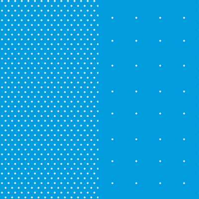
Points/Expanded Points
Points now include two styles: original Points and Expanded Points. These elements are flexible, simple patterns derived from the dotted lines of the Community Shield. Points can add depth and interest when layered with our other brand elements. Because of the suggested subtle application of this element, the Points pattern works well for casual designs.

H33
H33 is a herringbone pattern inspired by the 33-degree angle in the lower portion of the Penn State shield. The H33 pattern evokes a collegiate tone, and the fiber-like quality symbolizes our community of Penn Staters woven together. H33 works well in formal designs, and the pattern is flexible enough to be used as a background texture or as an accent on marketing materials.

Lines
The versatile line pattern features clean, repeating strokes and is offered in two line weights, allowing designers to create either a bold graphic texture or to achieve a subtle, refined layer. Like all brand graphic patterns, the lines pattern is intended to be layered within compositions and works best when applied lightly or with blend modes.

Grids
The four grid patterns are built with identical canvas and spacing measurements which allow multiple grid elements to be layered together for a custom look. These patterns are intended to add a math and research inspired texture to designs and provide an alignment structure for type and imagery. Like all brand graphic patterns, the grid patterns are intended to be layered within compositions and work best when applied lightly or with blend modes.
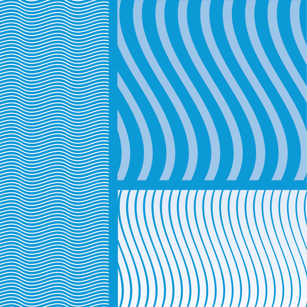
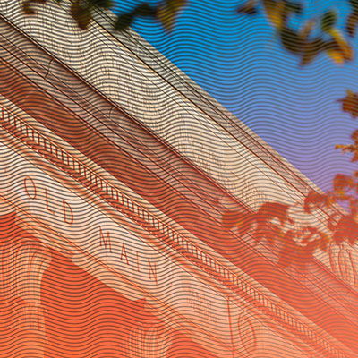
'S' Curve/'S' Flow
If you look closely at the Lion Shrine at University Park, you may notice an ‘S-shaped’ mark in its right ear. The ear had been cracked and expertly re-attached decades ago, and we pull inspiration from this story for these patterns as they represent the University’s strength and resilience to overcome obstacles.
The ‘S’ Flow is a variation on the ‘S’ Curve pattern, with variety in the thickness as well as transparency of the lines. These soft, curving patterns can be used for a variety of audiences.