Shield Elements

Inspired by the iconic Penn State shield featuring the Nittany Lion, these elements can add visual interest to marketing materials while seamlessly aligning with our core brand and identity. While this graphic category carries the strongest visual connection to our academic mark, it should not replace or compete with Penn State’s official academic mark or shield.

Corner shield, multiple white outline of the Penn State shield on a blue background
1 Shield Elements //

Community Shield

The Community Shield represents the diverse community of Penn Staters working together to positively impact the world. The points and lines of varying shapes and sizes connect and overlap to create an energy and motion for the design, just as individual Penn Staters contribute new and differing perspectives to the spirit of the University.

Download
Central Mood map, a square with the following text: formal at the top, subtle on the left, casual on the right, and bold on the right; and at navy dot in the center.

The Community Shield is central to the Penn State brand but is flexible enough to be used in designs ranging across the mood map.

Creative References //
Graphic of parts of the shield outline in white on top of a teal background
Photo of professor in the foreground with a fabric texture with navy overlay in the background and the words
Example image: A slice image of part of a infographic of the Penn State Harrisburg campus with shield outline
Example design: Slice of a design doc with the text
Example Design: Nittany lion on the right with his arms open and some text on the left with the white outline shield in the background
Multiple slightly transparent navy shield overlaying each other with a teal background
2 Shield Elements //

Shield Overlay

The Shield Overlay is a bold, semi-transparent pattern of Penn State shields and can be placed over a photo to add interest, texture, and a canvas for text. The Shield Overlay uses overlapping gradients to signify the strength and layers of our diverse community.
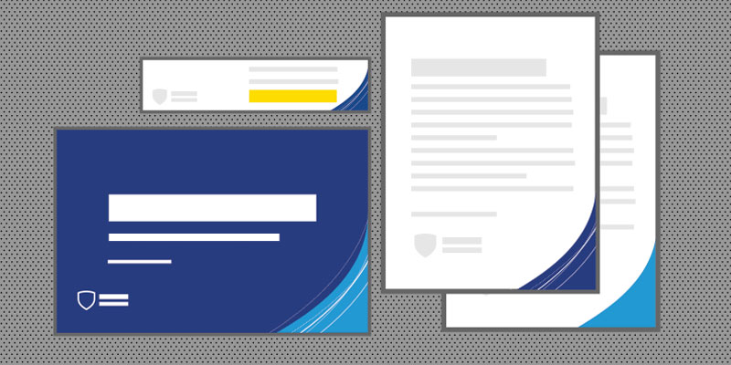
Download
Casual Bold Mood map, a square with the following text: formal at the top, subtle on the left, casual on the right, and bold on the right; and at navy dot in the bold and casual quadrant.

Because of the color aspects of this element, the Shield Overlay leans toward the casual and bold quadrants of the mood map. This element may work well in communications for prospective students, most social media networks, and other materials needing a bold and vibrant design.

Creative References //
Overlay Example: navy transparent shields on top of an image of people hand typing on laptop with white loreum ipsum text in the foreground
Overlay example - photo of a student on right with numerous transparent overlay on top of each other on left with white Lorem ipsum text on top.
Blue curved corner of the Penn State shield over a navy background.
3 Shield Elements //

Corner Shield

The Corner Shield adds a simple nod to our identity without overpowering a design. The placement of the Corner Shield can help draw attention to a design’s call to action or key messaging.

Download
Formal Bold mood map

When paired with the Community Shield, the Corner Shield skews toward the formal and bold quadrants of the mood map. Used apart from the Community Shield, the Corner Shield can be applied in more casual designs.

Creative References //
Corner Shield example - photo of Nittany Lion with arms open in the foreground with students in the background and wrapped with white transparent corner shield with white shield outline.
Corner Shield example - Graphic of documents with corner shield on the right.