
Design Essentials
Our visual identity, colors, fonts, and photography are fundamental to every design. The intentional use of these design essentials will align all our communications in a recognizable and visually consistent way.
Guidelines, file downloads, and other helpful information are available by clicking the download buttons throughout the site. For your convenience, a master download of all design toolkit guidelines and files is available. Before you begin, please read these guidelines carefully.
Our brand color palettes and design toolkit are available in four Adobe CC Libraries. These brand libraries offer in-Adobe app access and automatically update as edits, additions, and enhancements are made. Please click on the four links below to add our brand libraries to your Adobe Creative Cloud.

Visual Identity
Visual identity is the single most important visual element of our brand. Diligent use of the standards and requirements for our identity cements our brand at every level of our University, maintaining and advancing our brand recognition on a national and global stage.
Please visit the Visual Identity Standards section for more information on using the Penn State academic mark and shield.
Color
Continuing our efforts to strengthen the Penn State brand, we’ve enhanced our color guidelines for greater clarity and flexibility.
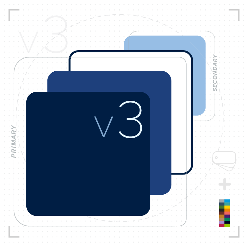
We’ve simplified the Penn State Brand Palette by embracing our primary brand colors (Nittany Navy, Beaver Blue, and White Out) and Pugh Blue as our secondary brand color.
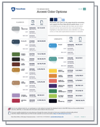
Additionally, our new guidelines feature a simple color formula, refined accent color options, useful pro tips, critical accessibility standards, and much more — all reinforcing the power of the Penn State brand.
Remember, your designs must always conform to Penn State’s accessibility standards. Be sure to reference the tools, resources, and examples of accessible ways to use our brand colors—especially for web text.
The Penn State Brand Palette
The four colors of our Penn State Brand Palette are central to the Penn State brand.
No matter the audience—whether your design is subtle or bold, formal or casual—consistently using the primary brand blues (Nittany Navy and Beaver Blue) strongly links your design to the Penn State brand.
Primary
Nittany Navy
- HEX: #001E44
- RGB: 4,30,66
- CMYK: 100/90/13/68
- PMS: 282
Beaver Blue
- HEX: #1e407c
- RGB: 30,64,124
- CMYK: 100/76/0/18
- PMS: 287
White out
- HEX: #ffffff
- RGB: 255,255,255
- CMYK: 0/0/0/0
- -
Secondary
Pugh Blue
- HEX: #96BEE6
- RGB: 150,190,230
- CMYK: 40/14/0/0
- PMS: 284
Download the color (v3) guidelines for extensive details on:
- simple formula detailing correct color use
- refined accent color options
- critical web accessibility standards, text/background combinations, and link colors

Photography
Compelling photography can evoke an emotional response and convey the optimism, authenticity, and active nature of the Penn State character. As we move toward this goal together, please use Canto as our continually updated resource for the latest collection of brand photography, approved for all marketing communications. Additional photography guidelines, tips, and tutorials are available in our downloadable photography resources.
The collage of images below represents what we aspire to communicate through all brand photography and videography. We aim to pair authenticity with a cinematic aesthetic. Natural and artificial light is shaped to enhance depth and texture with careful consideration given to the relationship between light, subject, and lens. Composition is always intentional—a tool to capture depth and a framing to direct focus to the subject and communicate a clear sense of place and purpose.


Fonts
Our brand fonts are another essential component to visually aligning your communications and designs with our brand. Beyond the PowerPoint fonts, our brand fonts afford options and flexibility for use in digital and for print, because of the power of Adobe Fonts and their Open Type design. For certain aesthetic and practical reasons, we are recommending specific fonts for certain uses or mediums:
Print: The Proxima Nova (Proxima Nova and Proxima Nova Condensed) and Serifa typefaces are recommended as they are well designed to render with significant accuracy at high resolution.
Web: The Roboto typeface (Roboto, Roboto Slab, and Roboto Condensed) is recommended and has advantages as a web typeface available from Adobe Fonts and Google Fonts.
Digital: (This includes social platforms, videos, and digital ads.) You have plenty of flexibility to use the Proxima Nova, Serifa, and Roboto typefaces for this non-web category.
PowerPoint: Franklin Gothic and Rockwell are recommended since these fonts are included within all Microsoft Office products.