
Mark Usage Examples
In order to maintain a strong visual identity system, it’s important to understand both proper and improper mark usage. The following examples provide explanations on how to use our mark effectively as well as what to avoid.
On Photos and Images
The positive and reverse versions of the University mark enable the marks to be placed on light and dark backgrounds. When using our mark on images, be mindful that the logotype has sufficient contrast over the background, has sufficient clear space, and is not placed on top of strong or distracting shapes or patterns.


NOTE: View the full standards on using our mark on light and dark backgrounds on the Color and the Mark page.
Websites
All Penn State websites should have a look and feel that is appropriately familiar to the Penn State brand. One important way to achieve this association is to place the appropriate University mark at the top of every webpage (top left in the brand bar component, for example). When visitors land on an entity’s website—no matter the origin of their journey—they should know unquestionably that they’ve landed on a Penn State website. This user experience is primarily achieved with the proper positioning of the University mark and secondly, with the implementation of our brand blue and white color palette. Please reference our online and in-depth color guidance. Please note that a website URL that includes “psu” does not provide a clear enough association to Penn State on its own.
Web Accessibility
All Penn State websites must be designed and maintained with accessibility in mind to ensure an inclusive, usable experience for all audiences. Refer to the Penn State Web Accessibility resources for practical guidance and tools. Policy AD54 establishes the standards that support consistency, usability, and compliance across the University’s web presence.


Social Media Avatars
The Penn State social media avatar guidelines are intended for all official Penn State social media accounts. These guidelines aim to achieve brand recognition, design consistency, and credibility with all Penn State social media avatars. Achieving all three goals protects and elevates the University’s image and reputation, while also providing needed design variety.
The Nittany Lion shield is used consistently to ground all social media avatar designs in the Penn State brand architecture. There are two avatar categories provided:
Category 1 avatars are reserved for Penn State social media accounts managed by the Office of Strategic Communications within the office of the President and for all the main social media accounts for all the Penn State Commonwealth Campuses. The avatars are provided in text and non-text versions.
Category 2 avatars are intended for all other colleges, schools, departments, units, institutes, centers, and administrative offices at Penn State. Although there are different limitations regarding name length across social media sites, the templates provided enable up to two lines of customizable text, as well as non-text options. If a name does not fit in the font point size and spacing provided in each text template, please use a non-text version. The specific text parameters are designed intentionally, please do not alter them.
The avatars provided are optimized for resolution and clarity. Resizing and cropping should be avoided, as this will alter the resolution and image quality of the avatar.
NOTE: Because of the uniquely small size of the avatar canvas, we are allowing an exception to the general visual identity guidelines that restrict locking-up text with the shield.
CATEGORY 1 // EXAMPLES
ADDITIONAL DESIGN OPTIONS ARE AVAILABLE UPON REQUEST.
CATEGORY 2 // EXAMPLES
ADDITIONAL DESIGN OPTIONS ARE AVAILABLE UPON REQUEST.
NOTE: Penn State social media avatars are available for download.
Mobile App
The Penn State Mobile App visual identity guidelines are intended for Penn State mobile apps relating to academic, research, and administrative functions including Outreach*. These guidelines aim for brand recognition, design consistency, and credibility. Achieving all three goals protects and elevates the University’s image and reputation, including each program, initiative, or unit creating an app.
*These guidelines do not directly apply to apps that are developed as part of a partnership, collaboration, or co-branded initiative. For clarification or support, please contact pennstatebrand@psu.edu.
Mobile App Overview
The Penn State name and/or visual identity should be properly represented in one or more of the following ways (as indicated): App Name (preferred), App Icon (mandatory), App Subtitle, Description, Promotional Text, and/or Keywords (preferred), App Screenshots or Previews (preferred), App Splash Screen (preferred), App Home Screen (mandatory).
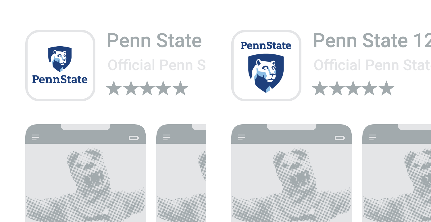
App Icon Option 1: A complete Penn State vertical 1 or vertical 2 mark helps to convey a credible, university-produced app.
App Icon Option 2: The Penn State icon template design uses the text “Penn State” in white on Nittany Navy and as Nittany Navy on white. Underneath this heading (that displays “Penn State”), designers can have full flexibility to incorporate custom text, colors, and other designs.
App Icon Option 3: The Nittany Lion shield alone. Because this option is not a mark that includes “Penn State,” consider using the Nittany Lion shield logo only if your app name includes “Penn State.”
App Icon Option 4: Using Proxima Nova, add your campus, college, or other unit name just below the Nittany Lion shield logo. Please follow the spacing used in the Penn State vertical 1 mark.
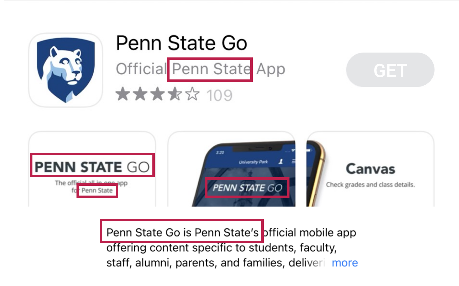
For brand recognition, using “Penn State” in one or more of the content fields is recommended.
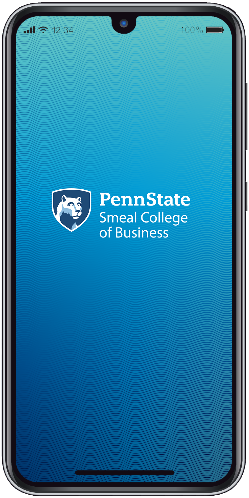
This introductory screen appears briefly while an app is loading. To maximize the full device canvas, consider using the University Mark or Tier 2 entity mark over an approved brand color or gradient. Several splash screen backgrounds are provided as options for your splash screen designs.
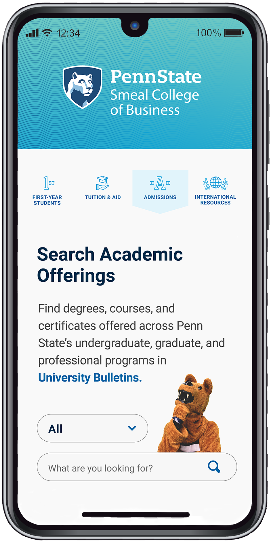
It is mandatory to use the Tier 2 entity mark identifying the associated Penn State campus, college, or administrative unit.
Additional Mobile App Developer Resources:
Apple’s App Developer Page / https://developer.apple.com/app-store/product-page/
Android’s App Developer Guide / https://developer.android.com/guide
NOTE: Only RGB files of Penn State’s academic marks should be used for mobile apps in order to reproduce accurate color.
NOTE: Because of the uniquely small size of a mobile app’s icon canvas, we are allowing an exception to the general visual identity guidelines that restrict locking-up text with the shield.
Penn State Mobile App Icons, Gradient Backgrounds and guidelines are available for download.
Merchandise
Trademark designations are required on all Penn State-owned marks (including the University mark) and logos that are used on merchandise or promotional product.


NOTE: Please email licensing@psu.edu with questions related to Penn State merchandise or visit the licensing website at licensing.psu.edu.
Mark Misuse
The University mark and associated visual identity system is the single most important visual element of our brand. Diligent application of the visual identity standards and requirements, cements our brand at every level of our University—maintaining and advancing our brand recognition on a national and global stage.
Never redraw or recreate our mark, including our Nittany Lion shield or “Penn State” logotype. Any modification of our mark diminishes its impact and weakens our legal protection. Only authorized artwork may be used.

DO NOT use the Beaver Blue logotype version of the University mark on a medium-to-dark background such that there is not sufficient color contrast between the logotype and the background. The reverse (REV) version of the University mark should be used in this instance.

DO NOT add text directly below any institutional mark in a manner that does not respect the required clear space around the mark.

DO NOT use a black and white mark on any digital deliverable or medium. A black and white mark can only be used in print and only when color printing is not possible.
NOTE: the use of a black and white mark or one or two-color marks should never be used as a design preference; these marks are intended for specific, limited, technical applications.

DO NOT place a University mark close to text in a manner that does not respect the required clear space around the mark.

DO NOT remove the left bridge area of the nose on the Nittany Lion.
DO NOT crop the Nittany Lion shield avatar in a manner that clips any part of the shield.