Color and the Mark
Color is an important component of Penn State’s visual heritage. Our University mark and shield feature three of the four colors of our Penn State brand palette and are central to the Penn State brand.
Three-Color (3C) Mark
The preferred version of the University mark is the three-color version featuring White Out and two brand blue colors: Beaver Blue (Pantone 287) with Pugh Blue (Pantone 284) accents. This three-color mark is required whenever it is technically possible.


NOTE: Choose your promotional product based on the understanding that the three color mark should be used whenever technically possible. The use of a black and white mark or one or two-color marks should never be used as a design preference; these marks are intended for specific, limited, technical applications.
Three-Color (3C) Reverse Mark
The reverse marks are not simply the positive marks with white logotype. The scale, position, and line weights have been optically adjusted. Use the reverse marks on dark backgrounds in order to achieve sufficient, accessible color contrast.


One-Color (1C) Mark
For communications needs, the three-color University mark featuring White Out, Beaver Blue (Pantone 287), and Pugh Blue (Pantone 284) is always preferred. However, there may be production processes or use cases that cannot facilitate a multiple color application. In these scenarios, a one-color mark should be used and must appear in White Out or Beaver Blue (Pantone 287) only. This version of the University mark is the only mark in which the Nittany Lion or the background area within the Nittany Lion shield is transparent, which means that the color or material on which the one-color mark is applied will fill within the Nittany Lion shield.
DO NOT attempt to create a one-color mark by simply assigning white or Beaver Blue to a two-color black mark. One-color marks are not downloadable from this site, however, the University’s licensed vendors will have access to these marks as they are used primarily for merchandise.


Incorrect Use
Please see one-color mark misuse examples below. These examples are incorrect because the contrast is too low, the incorrect one-color mark is used, and the background color of the last t-shirt is too busy with non-approved colors.


Special Use Applications
When choosing a mark, the three-color University mark featuring White Out, Beaver Blue (Pantone 287), and Pugh Blue (Pantone 284) is always preferred. However, certain production processes are technically limited to one color and require a special mark (ex. engraving, embossing, debossing, etching, and foil stamping). These special use marks are the only marks in which the Nittany Lion or the background area within the Nittany Lion shield is transparent. This means that the background color or material on which the special use mark is applied will fill this transparent portion within the shield. Because of this, the appropriate special use mark may only be used on white, medium-to-navy blue, or black—or in the case of embossing or etching for example, the product or material color could be a neutral color. To reiterate, the transparent portion within the Nittany Lion shield should never appear to be filled with any color other than white, medium-to-navy blue, black, or an approved neutral color.
NOTE: DO NOT attempt to create a one-color mark. Special use marks are not downloadable from this site since the University’s licensed vendors have access to these marks as they are primarily used for merchandise.


Use on Background Colors and Designs
The sole purpose of the two types of mark designs (one featuring the Beaver Blue logotype and one featuring the White Out logotype) is to achieve proper contrast and readability over all types of backgrounds.
NOTE: Never attempt to edit or alter University marks. Although the positive and reverse marks appear very similar aside from the color of the logotype, there are subtle design differences between each.
Light Backgrounds
The three-color University mark (see examples below) with the Beaver Blue (Pantone 287) logotype is designed for use on light backgrounds.


Dark Backgrounds
The three-color reverse University mark (see examples below) with the white logotype is designed for use on dark backgrounds.


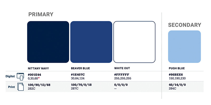
Color Specifications
The four colors of our Penn State Brand Palette are central to the Penn State brand. The brand color palette consists of the primary brand colors (Nittany Navy [Pantone 282], Beaver Blue [Pantone 287], and White Out) and the secondary brand color (Pugh Blue [Pantone 284]). The University mark features Beaver Blue (Pantone 287) and White Out and the secondary brand color Pugh Blue (Pantone 284). The Athletics mark features Nittany Navy (Pantone 282) and White Out.
No matter the audience, whether your design is subtle or bold, formal or casual — consistently using the primary brand blues (Nittany Navy and Beaver Blue) strongly links your design to the Penn State brand.


Color Modes
CMYK
This color mode is used for full-color printing and is also called “four-color” and “process” printing. This color system is used for digital printing. “CMYK” is an acronym for Cyan, Magenta, Yellow, and Black.
RGB
This color mode is used for computer monitors, video, etc. “RGB” is an acronym for Red, Green, and Blue.
HEX
HEX codes are hexadecimal values used for specifying RGB colors for the web. They are written as six-digit combinations of letters and numbers preceded by a pound sign (#). For example, the hex code for Nittany Navy is #001E44.
PMS
The Pantone Matching System® (PMS) is comprised of thousands of numbered swatches. PMS colors are also called “spot” colors. This system creates the most accurate color match and the sharpest details.