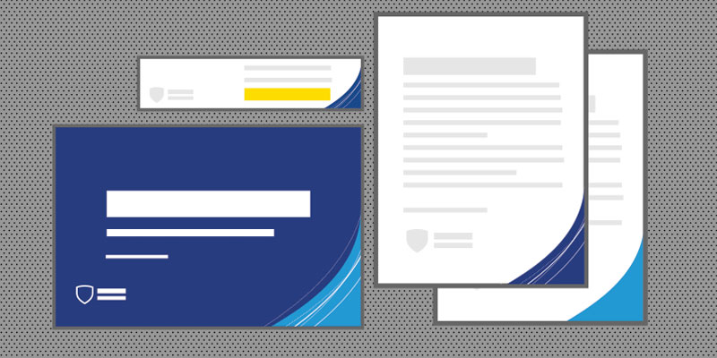
Templates

Templates are a quick and easy way to maintain brand consistency in your PowerPoint presentations, videos, and social media posts. These tools take the guesswork out of proper logo placement while saving you time with pre-added design features. Templates will continue to be added for your use.

Three stacked Penn State PowerPoint template slides with text placeholders
1 Templates //

PowerPoint

Three brand PowerPoint templates are natively accessible in the University’s Microsoft tenet; simply select New from Template to get started. The three templates provide an accessible, on-brand foundation for your presentations and now include several more master slide layouts to choose from.

Download
Two images: one with a video title placeholder, and one with a video lower-third title over a student in a lab setting
2 Templates //

Video

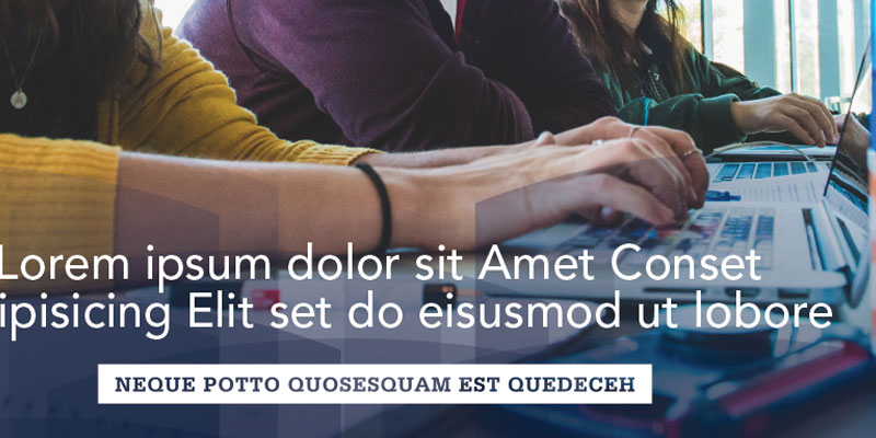
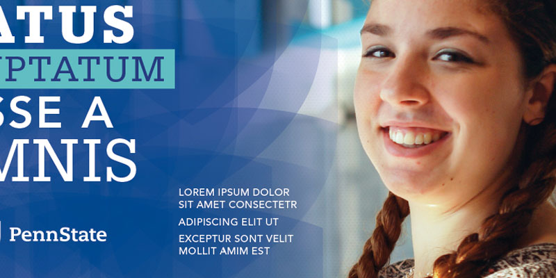
Three motiongraphic (mogrt) templates are available for download and use in Adobe Premiere. The newest mogrt is built in 4K resolution and offers highly adaptable controls for creating animated title slates, lower third identifiers, and pull quotes. In all three video templates, you’ll find on-brand designs, brand colors, and integrated brand patterns to choose from. Controls make it easy to apply many University marks, use approved typefaces, and ensure alignment to our Penn State visual identity.

Also available for download is our Video Guidelines—a technical guide with a foundational reference to our brand messaging and storytelling frameworks. This resource should prove valuable for a variety of experience levels and includes a link to a live video workshop covering much of the guideline material.
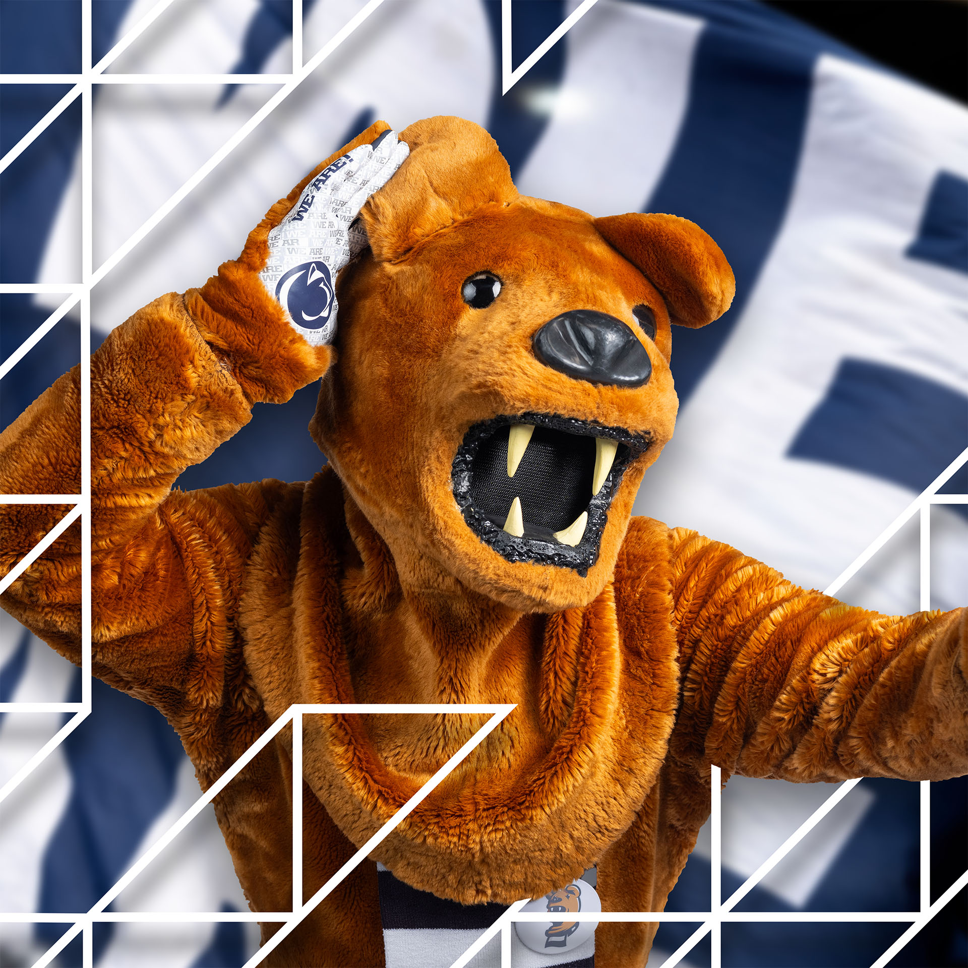
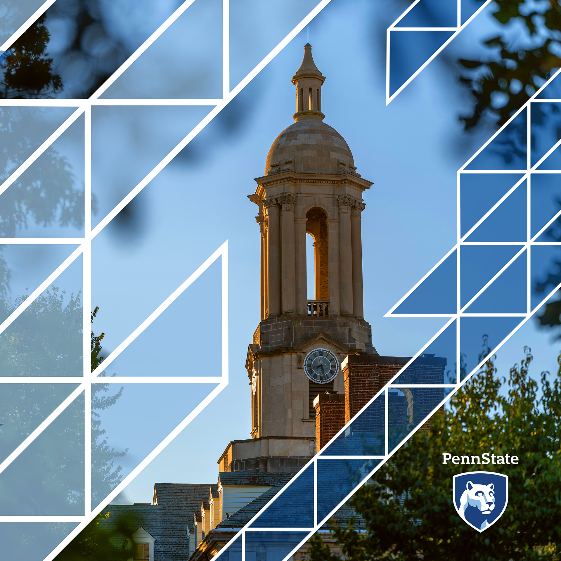
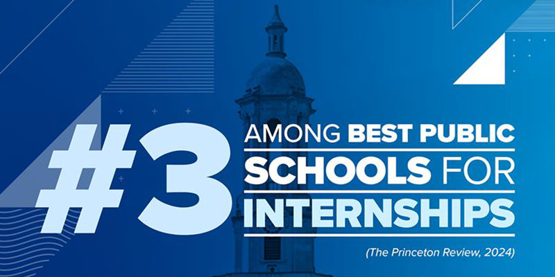
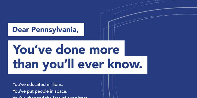
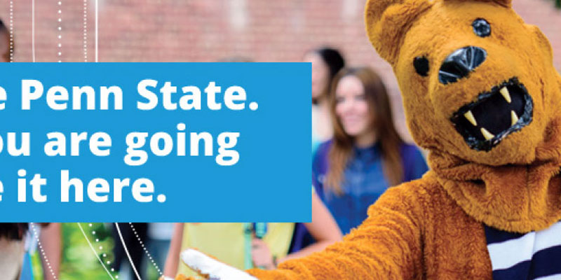
Download
Penn State Community Shield shape design on a blue background
3 Templates //

Social Backgrounds

As our first social-specific brand element, Social Backgrounds provide an easy way for you to incorporate visual brand consistency into your posts. All backgrounds are provided in widescreen, square, and vertical aspect ratios with and without the Community Shield design.

Download

Gradients

Gradients are supplemental design elements that can make photos and patterned backgrounds more dynamic and compelling. Adding a gradient can soften a photo and create a canvas for design content and typography.

A dark blue to transparent white filter effect
1 Gradients //

Color Filters

Because of their vibrant and transformative nature, Color Filters add an optimistic and organic quality to your photos. Color Filters are available in multiple colors from our three brand palettes. Be sure to align the colors you choose with the content and audience of your creative. Learn more about matching colors to your messaging in the colors section.

Download
Creative References //
Color Filter example - instructor in the foreground with a teal and navy color filter in the background and on the left text saying
Color Filter example - student raising their hand and to the right is a filtered navy blue color with white lorem ipsum text

Graphic Patterns

Graphic patterns act as a secondary layering technique to add texture and depth, and they should always be used subtly even on bold designs.

Points/Expanded Points design - white dotes producing line on a light blue background
1 Graphic Patterns //

Points/Expanded Points

Points now include two styles: original Points and Expanded Points. These elements are flexible, simple patterns derived from the dotted lines of the Community Shield. Points can add depth and interest when layered with our other brand elements. Because of the suggested subtle application of this element, the Points pattern works well for casual designs.

Download
H33 pattern - repeated grey and dark grey herringbone pattern design with a 33 degree angle
2 Graphic Patterns //

H33

H33 is a herringbone pattern inspired by the 33-degree angle in the lower portion of the Penn State shield. The H33 pattern evokes a collegiate tone, and the fiber-like quality symbolizes our community of Penn Staters woven together. H33 works well in formal designs, and the pattern is flexible enough to be used as a background texture or as an accent on marketing materials.

Download
Lines patterns - horizontal grey lines to over a navy background color
3 Graphic Patterns //

Lines

The versatile line pattern features clean, repeating strokes and is offered in two line weights, allowing designers to create either a bold graphic texture or to achieve a subtle, refined layer. Like all brand graphic patterns, the lines pattern is intended to be layered within compositions and works best when applied lightly or with blend modes.

Download
Layered grid pattern of vertical, horizontal, and diagonal lines, with circles and plus shapes marking intersections
4 Graphic Patterns //

Grids

The four grid patterns are built with identical canvas and spacing measurements which allow multiple grid elements to be layered together for a custom look. These patterns are intended to add a math and research inspired texture to designs and provide an alignment structure for type and imagery. Like all brand graphic patterns, the grid patterns are intended to be layered within compositions and work best when applied lightly or with blend modes.

Download
Three examples of the S curve
5 Graphic Patterns //

'S' Curve/'S' Flow

If you look closely at the Lion Shrine at University Park, you may notice an ‘S-shaped’ mark in its right ear. The ear had been cracked and expertly re-attached decades ago, and we pull inspiration from this story for these patterns as they represent the University’s strength and resilience to overcome obstacles.

The ‘S’ Flow is a variation on the ‘S’ Curve pattern, with variety in the thickness as well as transparency of the lines. These soft, curving patterns can be used for a variety of audiences.

Download
Creative References //
Old Main with Heinz Flow pattern overlaid
Points design example - navy dots over blue background behind white, bold text and light blue bar with navy blue text
Lines pattern example - photo of instructor seemingly touching a ripple with thin grey lines running horizontally thought-out the image
Lines pattern example - yellow bar with diagonal lines representing a timeline bar with infographics and text
Points design example - light blue dots over blue background with graphic of a white outline water bottle with the Penn State mark in the middle and some static numbers on the right

Geometrics

Geometric elements feature bold and graphical designs, influenced by Penn State architectural and structural details. Based on your design choices (including transparency, blend modes, and positioning), you can use these elements for a variety of moods and audiences.

Examples of XHUB brand elements on a solid background
1 Geometrics //

HUB and Expanded HUB

Inspired by architectural details like the ceiling of the HUB-Robeson Center at University Park, the HUB and Expanded HUB elements add sophistication and character to designs and photos. The HUB and Expanded HUB geometrics embrace the structural strength of a simple triangle pattern and honor the University’s foundations.

Download
Creative References //
HUB design over Nittany Lion mascot
XHUB design elements layered with THON photo
HUB geometric framing Old Main belltower
Power Fact text with XHUB element background
Limestone geometric design - white outline representing limestones brick on top of a light blue background
2 Geometrics //

Limestone

As an abundant mineral resource in Pennsylvania, limestone is an important historical element found throughout Penn State—from the construction of campus buildings to signs across the Commonwealth. The Limestone geometric reflects Penn State’s strong foundation in communities across Pennsylvania.

Download
Creative References //
Large PSU letters on grassy field covered in confetti
Stone monument on blue background
Student in lab setting wearing lab coat and safety glasses
Penn State Alma Mater text over a photo of Old Main building
We Are Penn State logo over dark blue background
Outdoor evening photo of the Palmer Museum of Art

Shield Elements

Inspired by the iconic Penn State shield featuring the Nittany Lion, these elements can add visual interest to marketing materials while seamlessly aligning with our core brand and identity. While this graphic category carries the strongest visual connection to our academic mark, it should not replace or compete with Penn State’s official academic mark or shield.

Community shield detail on solid background
1 Shield Elements //

Community Shield

The Community Shield represents the diverse community of Penn Staters working together to positively impact the world. The points and lines of varying shapes and sizes connect and overlap to create an energy and motion for the design, just as individual Penn Staters contribute new and differing perspectives to the spirit of the University.

Download
Creative References //
Graphic of parts of the shield outline in white on top of a teal background
Photo of professor in the foreground with a fabric texture with navy overlay in the background and the words
Example image: A slice image of part of a infographic of the Penn State Harrisburg campus with shield outline
Example design: Slice of a design doc with the text
Example Design: Nittany lion on the right with his arms open and some text on the left with the white outline shield in the background
Multiple slightly transparent navy shield overlaying each other with a teal background
2 Shield Elements //

Shield Overlay

The Shield Overlay is a bold, semi-transparent pattern of Penn State shields and can be placed over a photo to add interest, texture, and a canvas for text. The Shield Overlay uses overlapping gradients to signify the strength and layers of our diverse community.

Download
Creative References //
Overlay Example: navy transparent shields on top of an image of people hand typing on laptop with white loreum ipsum text in the foreground
Overlay example - photo of a student on right with numerous transparent overlay on top of each other on left with white Lorem ipsum text on top.
Blue curved corner of the Penn State shield over a navy background.
3 Shield Elements //

Corner Shield

The Corner Shield adds a simple nod to our identity without overpowering a design. The placement of the Corner Shield can help draw attention to a design’s call to action or key messaging.

Download
Creative References //
Corner Shield example - photo of Nittany Lion with arms open in the foreground with students in the background and wrapped with white transparent corner shield with white shield outline.
Corner Shield example - Graphic of documents with corner shield on the right.

Design Essentials

Our visual identity, colors, fonts, and photography are fundamental to every design. The intentional use of these design essentials will align all our communications in a recognizable and visually consistent way.

Guidelines, file downloads, and other helpful information are available by clicking the download buttons throughout the site. For your convenience, a master download of all design toolkit guidelines and files is available. Before you begin, please read these guidelines carefully.

Our brand color palettes and design toolkit are available in four Adobe CC Libraries. These brand libraries offer in-Adobe app access and automatically update as edits, additions, and enhancements are made. Please click on the four links below to add our brand libraries to your Adobe Creative Cloud.

Three Penn State marks; the primary mark and a two Tier-2 marks
1 Design Essentials //

Visual Identity

Visual identity is the single most important visual element of our brand. Diligent use of the standards and requirements for our identity cements our brand at every level of our University, maintaining and advancing our brand recognition on a national and global stage.

Please visit the Visual Identity Standards section for more information on using the Penn State academic mark and shield.

Diagram of Penn State primary and secondary brand color swatches
2 Design Essentials //

Color

Continuing our efforts to strengthen the Penn State brand, we’ve enhanced our color guidelines for greater clarity and flexibility.

We’ve simplified the Penn State Brand Palette by embracing our primary brand colors (Nittany Navy, Beaver Blue, and White Out) and Pugh Blue as our secondary brand color.

Additionally, our new guidelines feature a simple color formula, refined accent color options, useful pro tips, critical accessibility standards, and much more — all reinforcing the power of the Penn State brand.


Remember, your designs must always conform to Penn State’s accessibility standards. Be sure to reference the tools, resources, and examples of accessible ways to use our brand colors—especially for web text.

Download
2ADesign Essentials // Brand Palette

The Penn State Brand Palette

The four colors of our Penn State Brand Palette are central to the Penn State brand.

No matter the audience—whether your design is subtle or bold, formal or casual—consistently using the primary brand blues (Nittany Navy and Beaver Blue) strongly links your design to the Penn State brand.

Primary

Nittany Navy
  • HEX: #001E44
  • RGB: 4,30,66
  • CMYK: 100/90/13/68
  • PMS: 282
Beaver Blue
  • HEX: #1e407c
  • RGB: 30,64,124
  • CMYK: 100/76/0/18
  • PMS: 287
White out
  • HEX: #ffffff
  • RGB: 255,255,255
  • CMYK: 0/0/0/0
  • -

Secondary

Pugh Blue
  • HEX: #96BEE6
  • RGB: 150,190,230
  • CMYK: 40/14/0/0
  • PMS: 284
Preview image of Penn State brand color guidelines document

Download the color (v3) guidelines for extensive details on:

  • simple formula detailing correct color use
  • refined accent color options
  • critical web accessibility standards, text/background combinations, and link colors

Download the Color (v3) guidelines.

Download
Graphic image of a camera view finder
3 Design Essentials //

Photography

Compelling photography can evoke an emotional response and convey the optimism, authenticity, and active nature of the Penn State character. As we move toward this goal together, please use Canto as our continually updated resource for the latest collection of brand photography, approved for all marketing communications. Additional photography guidelines, tips, and tutorials are available in our downloadable photography resources.

Download
List of brand fonts for print, web, and powerpoint
4 Design Essentials //

Fonts

Our brand fonts are another essential component to visually aligning your communications and designs with our brand. Beyond the PowerPoint fonts, our brand fonts afford options and flexibility for use in digital and for print, because of the power of Adobe Fonts and their Open Type design. For certain aesthetic and practical reasons, we are recommending specific fonts for certain uses or mediums: 

 
Print: The Proxima Nova (Proxima Nova and Proxima Nova Condensed) and Serifa typefaces are recommended as they are well designed to render with significant accuracy at high resolution.
  
Web: The Roboto typeface (Roboto, Roboto Slab, and Roboto Condensed) is recommended and has advantages as a web typeface available from Adobe Fonts and Google Fonts.  

Digital: (This includes social platforms, videos, and digital ads.) You have plenty of flexibility to use the Proxima Nova, Serifa, and Roboto typefaces for this non-web category. 
 
PowerPoint: Franklin Gothic and Rockwell are recommended since these fonts are included within all Microsoft Office products.

Download